Nostalgia Meets Purpose
When I started working on the branding for Twinkle Houses®—a project dedicated to empowering autistic children through creative cardboard coloring playhouses and hands-on artistic tools—my goal was to craft a brand identity that feels nostalgic. The idea was to capture that warm, retro American vibe we all know—something cozy, familiar, and undeniably fun—so both kids and parents could easily connect with it. I wanted the brand to feel approachable, while also inspiring creativity.
Color Palette
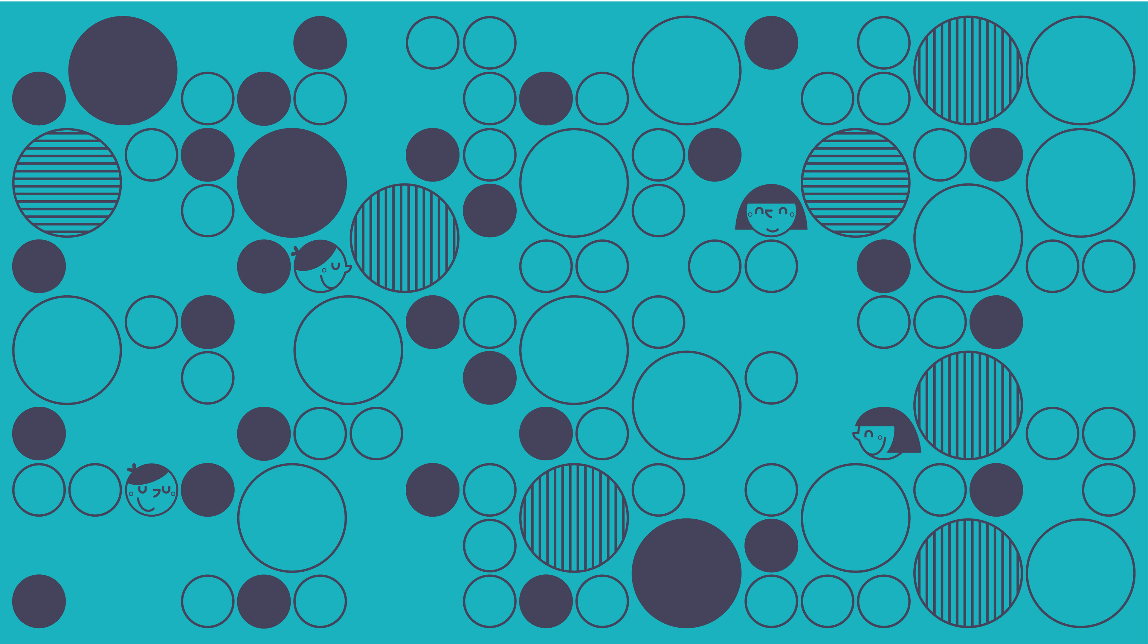
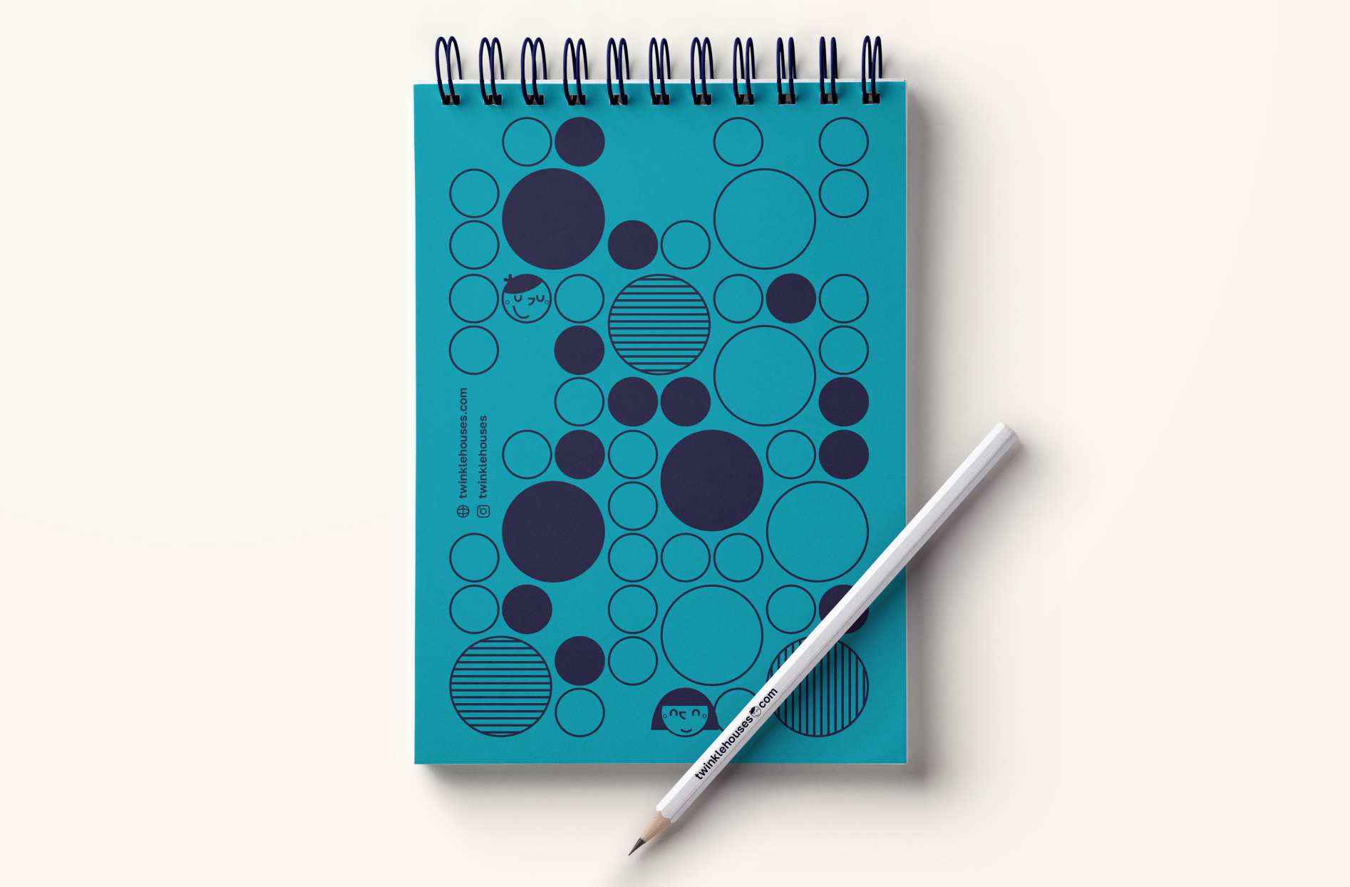
The color palette was instrumental in shaping the brand’s identity. I selected navy for its ability to convey stability and trust, giving the brand a solid foundation. Turquoise, with its vibrant and playful energy, brought the creative element that was essential for reflecting the hands-on nature of the products. To ensure balance, I introduced a soft cream tone, not just as a neutral, but to add warmth and cohesion to the overall design. It allows the brighter colors to stand out while maintaining a sense of harmony.


Logo
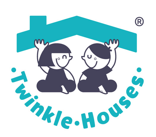
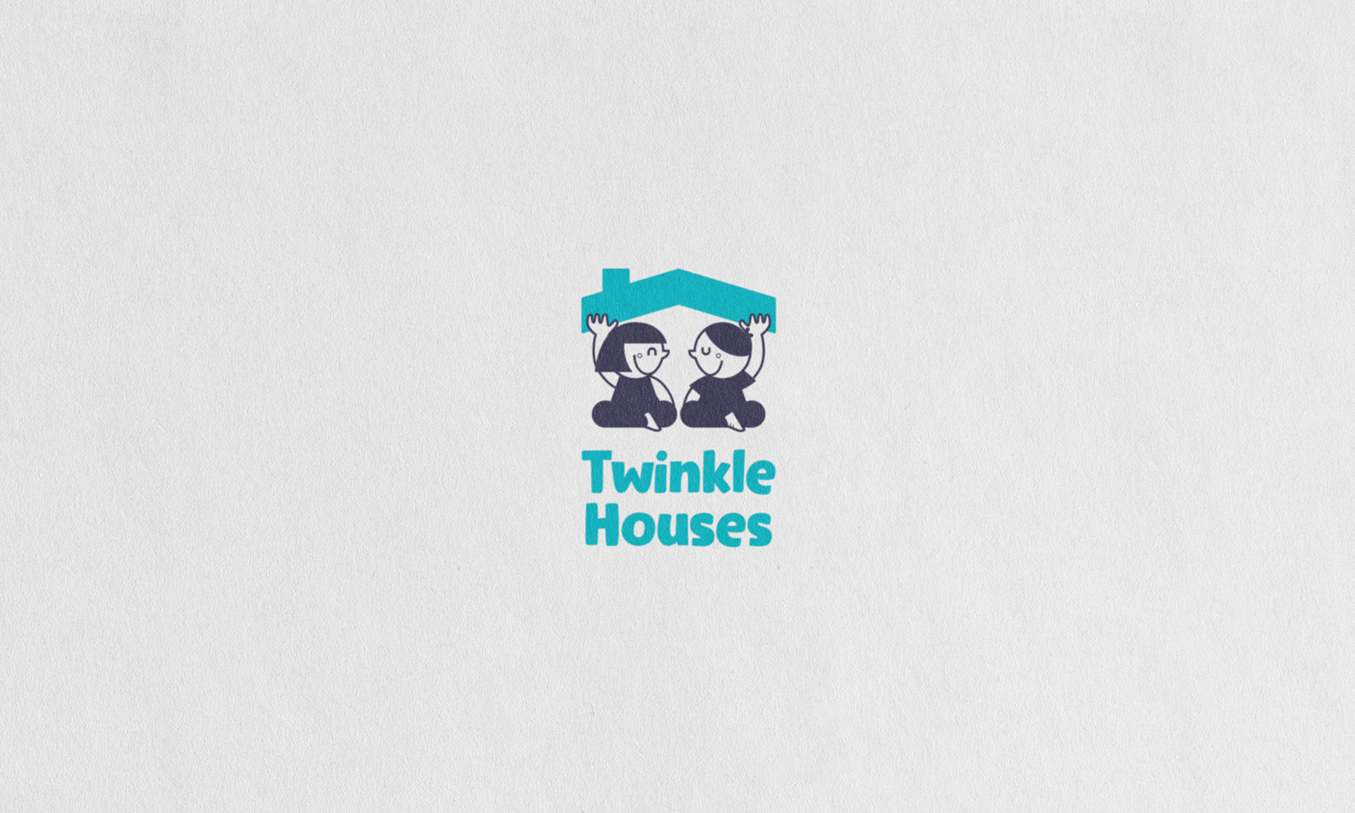
For the logo, I was inspired by a touch of Disney magic. I imagined two children, with a retro charm, joyfully lifting a house roof. Their expressions, full of warmth and happiness, really capture the playful spirit that Twinkle Houses® stands for. The "Twinkle" element became a key part of the visual strategy, balancing whimsy with purpose to reflect the brand’s core values of creativity and empowerment. Every design choice, from the colors to the typography, was carefully thought through to ensure the identity stays strong and consistent across all touchpoints, whether it’s packaging or digital platforms.
The videos for Twinkle Houses® were developed with the goal of showcasing the buttery smooth texture of the oil pastel crayons and highlighting their key benefits. Rather than simply explaining, I demonstrated the product in action within the video, drawing an image to show how easily the colors blend and glide. Using Premiere Pro for editing, I ensured the presentation remained clean and precise, allowing the crayons to take center stage and giving viewers a real sense of the product's quality and creative potential.
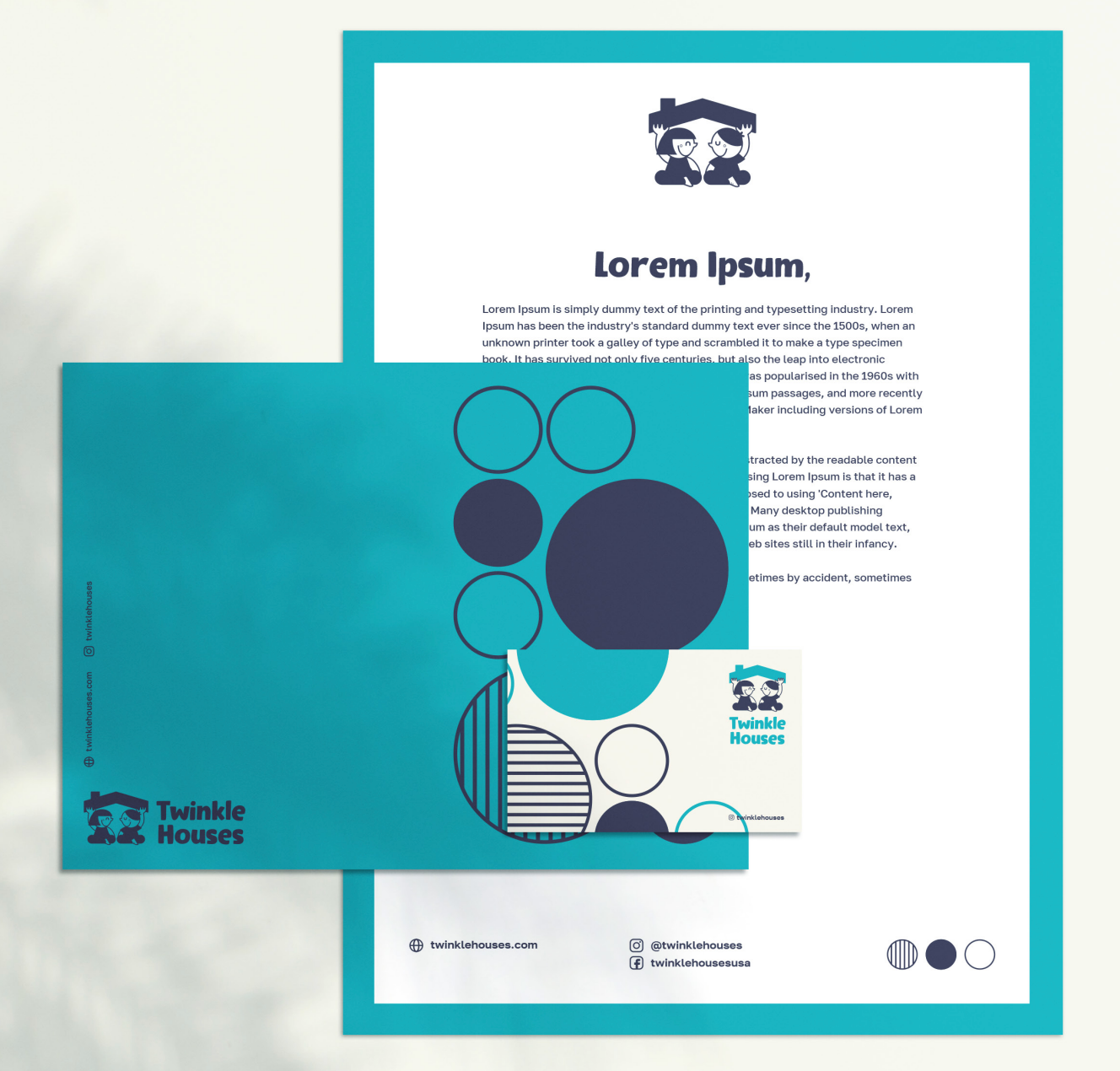
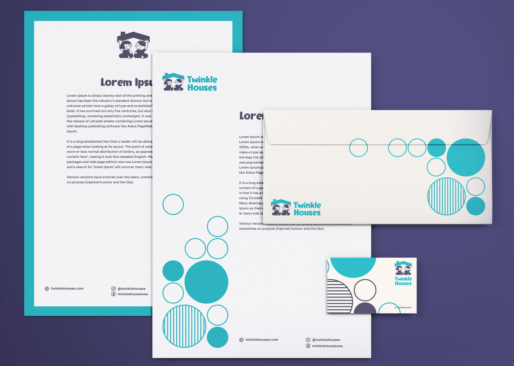
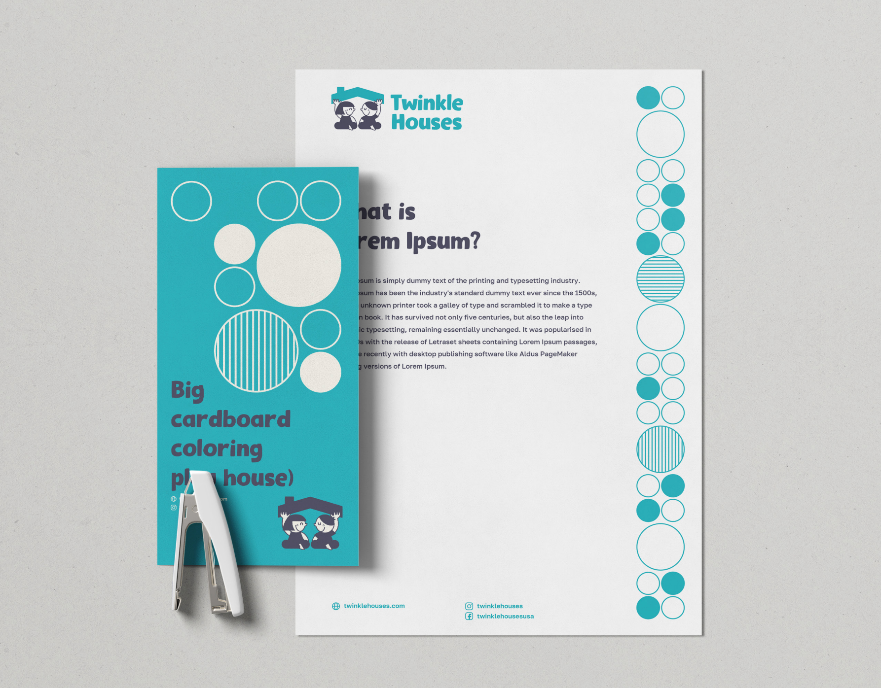
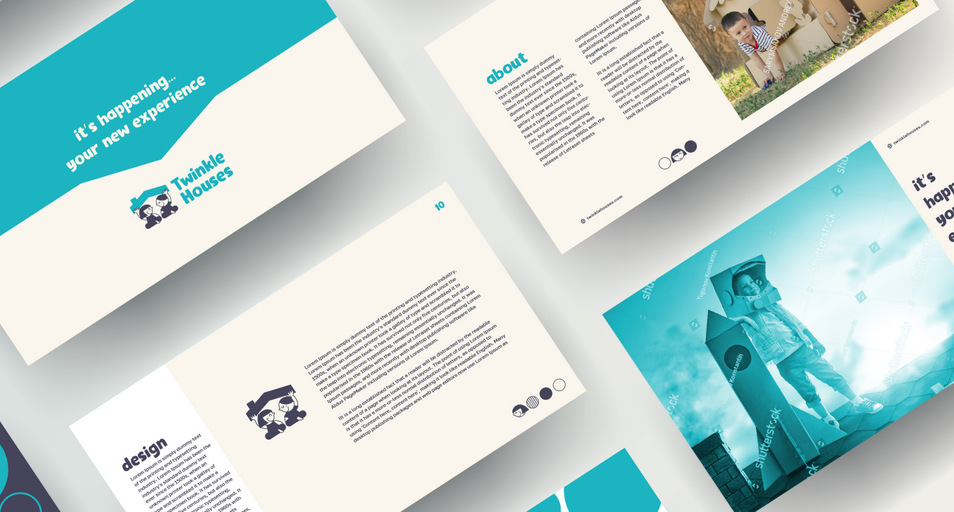
For a more genuine representation, the Twinkle Houses® logo was displayed on textured paper to mimic its appearance on the final cardboard packaging, giving a realistic sense of how it would look on the finished product.
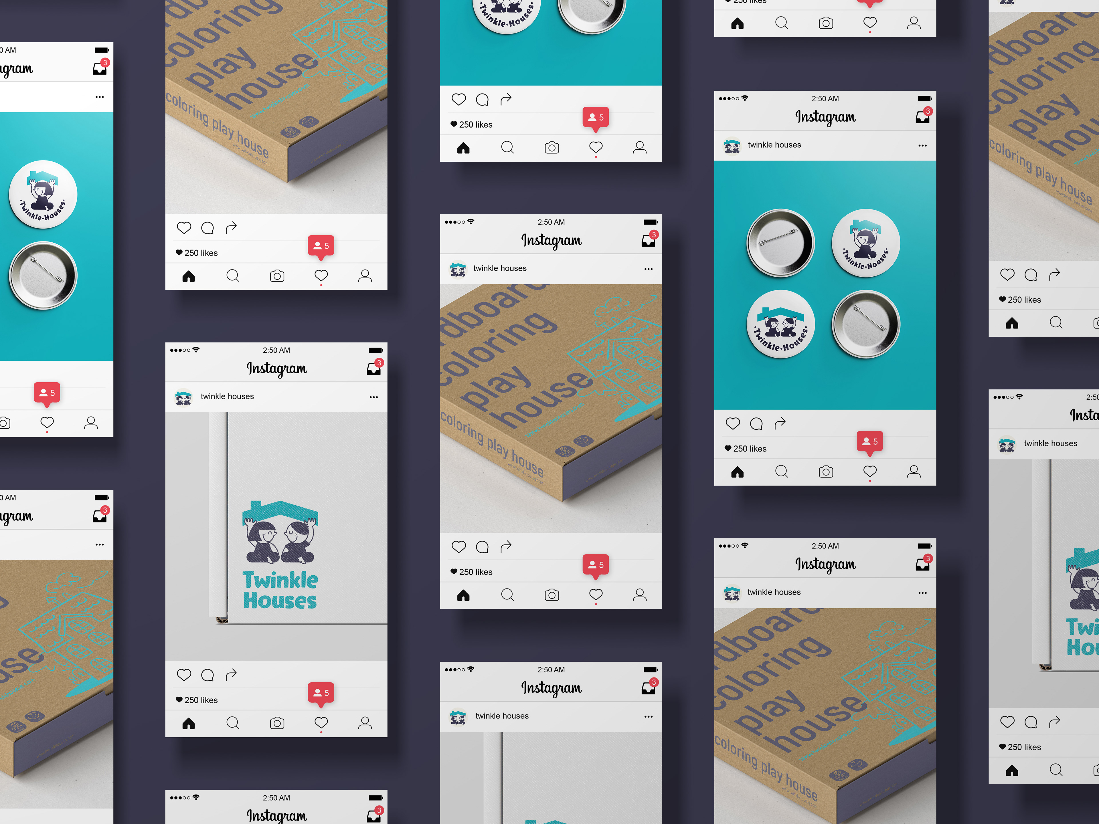
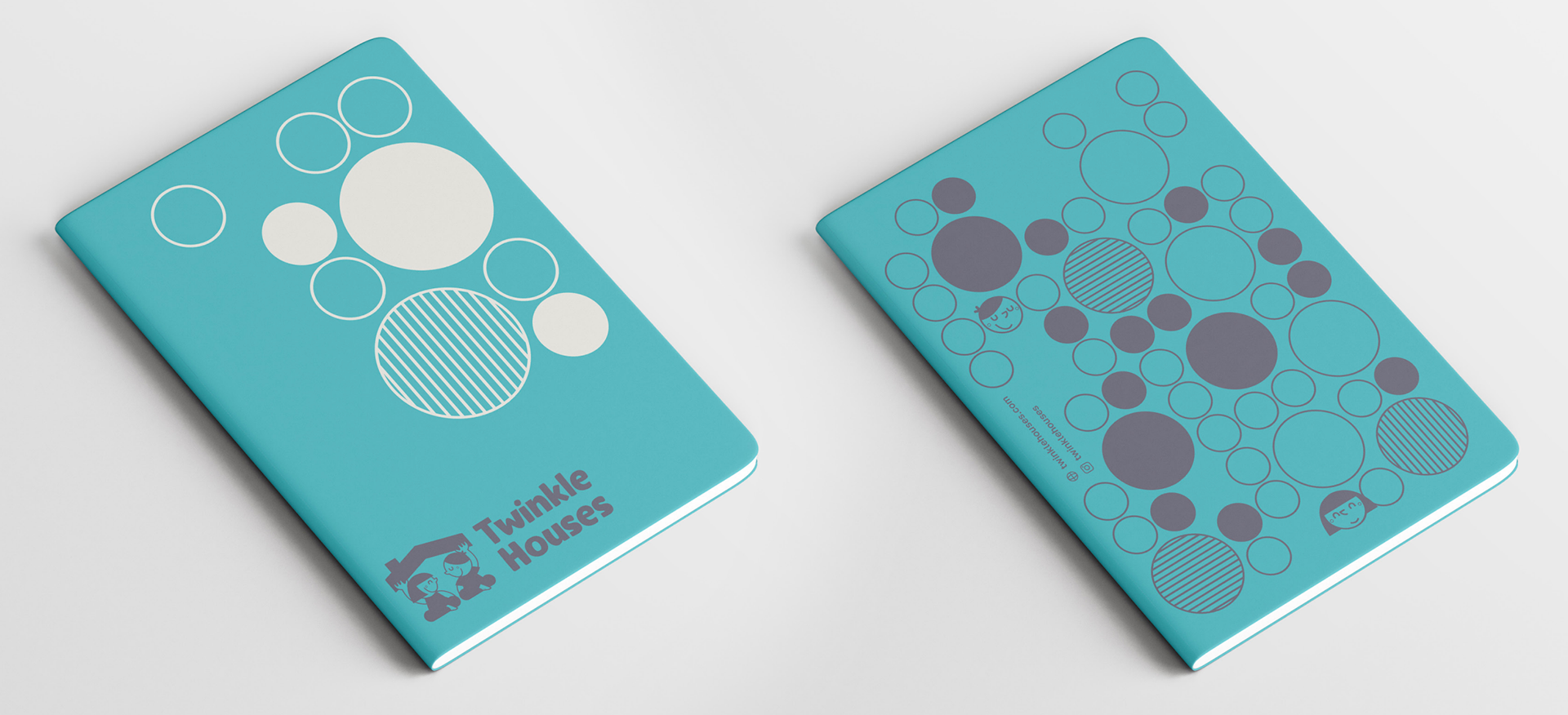
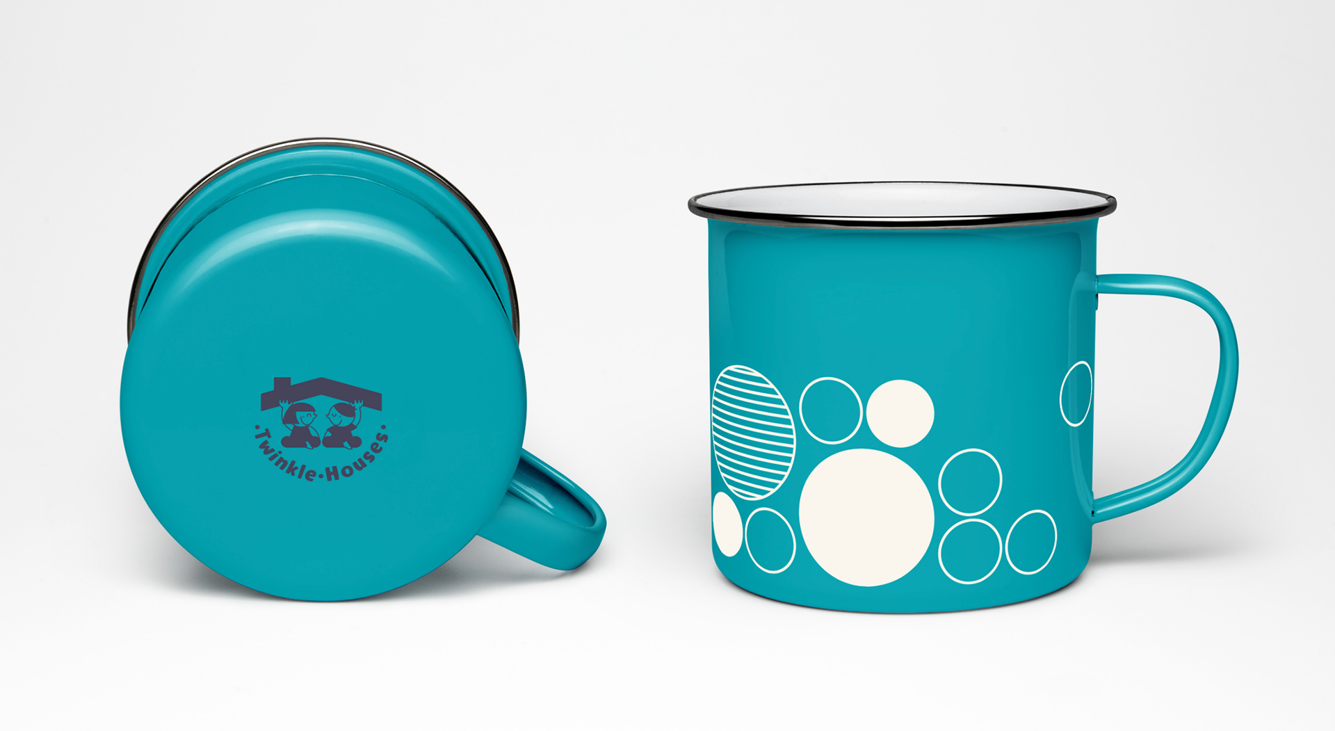
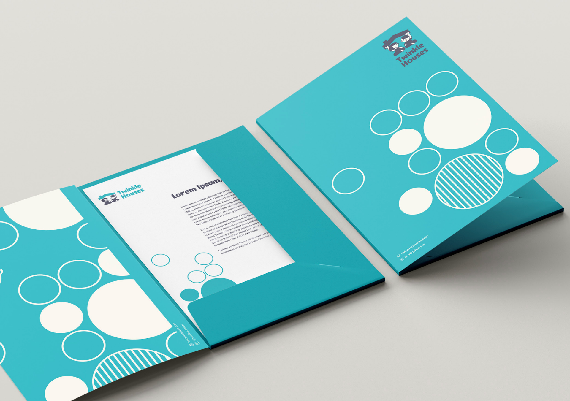
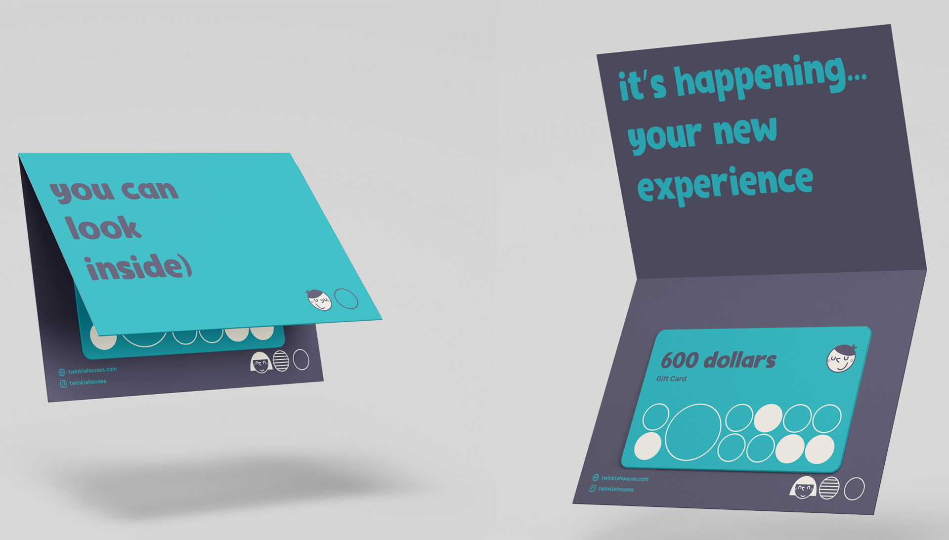
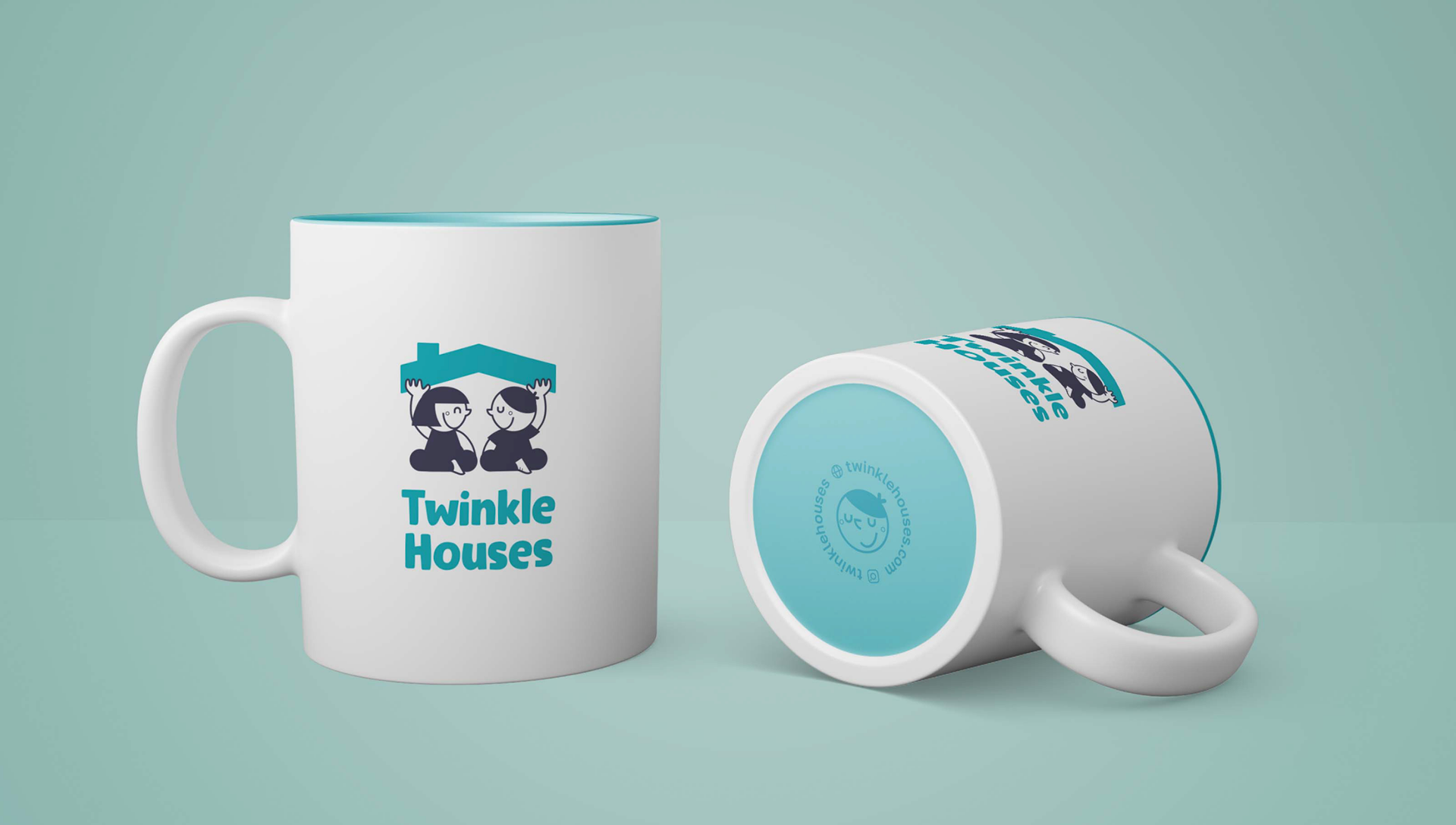
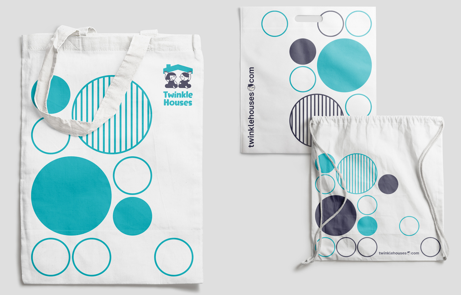
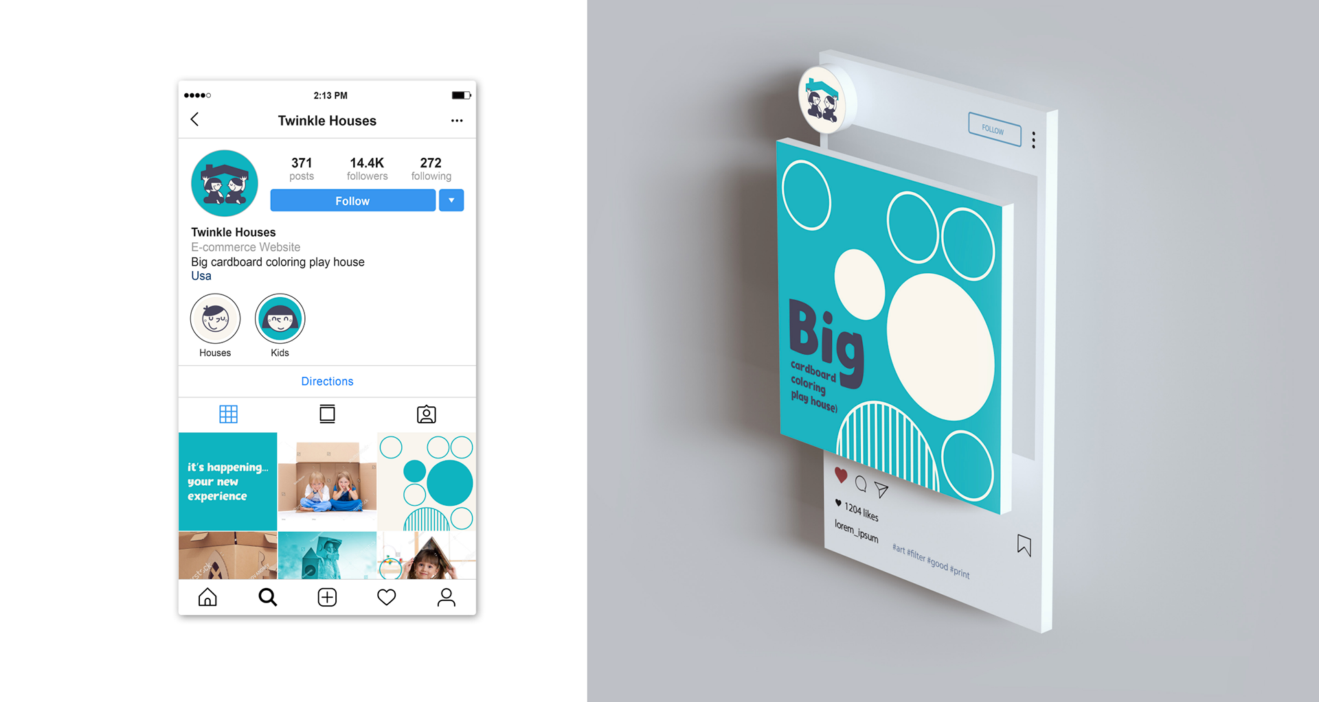
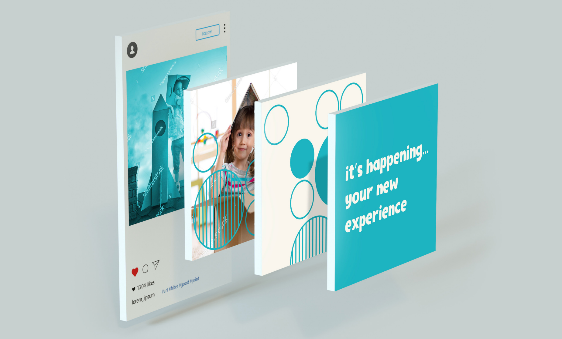
The Twinkle Houses® brand identity was brought to life across various branded assets, demonstrating how the logo adapts seamlessly in real-world settings while maintaining consistency with the brand’s visual strategy across various touchpoints.
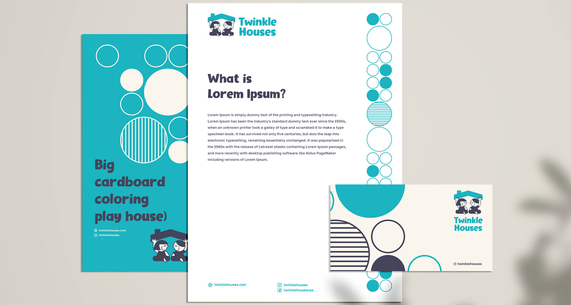
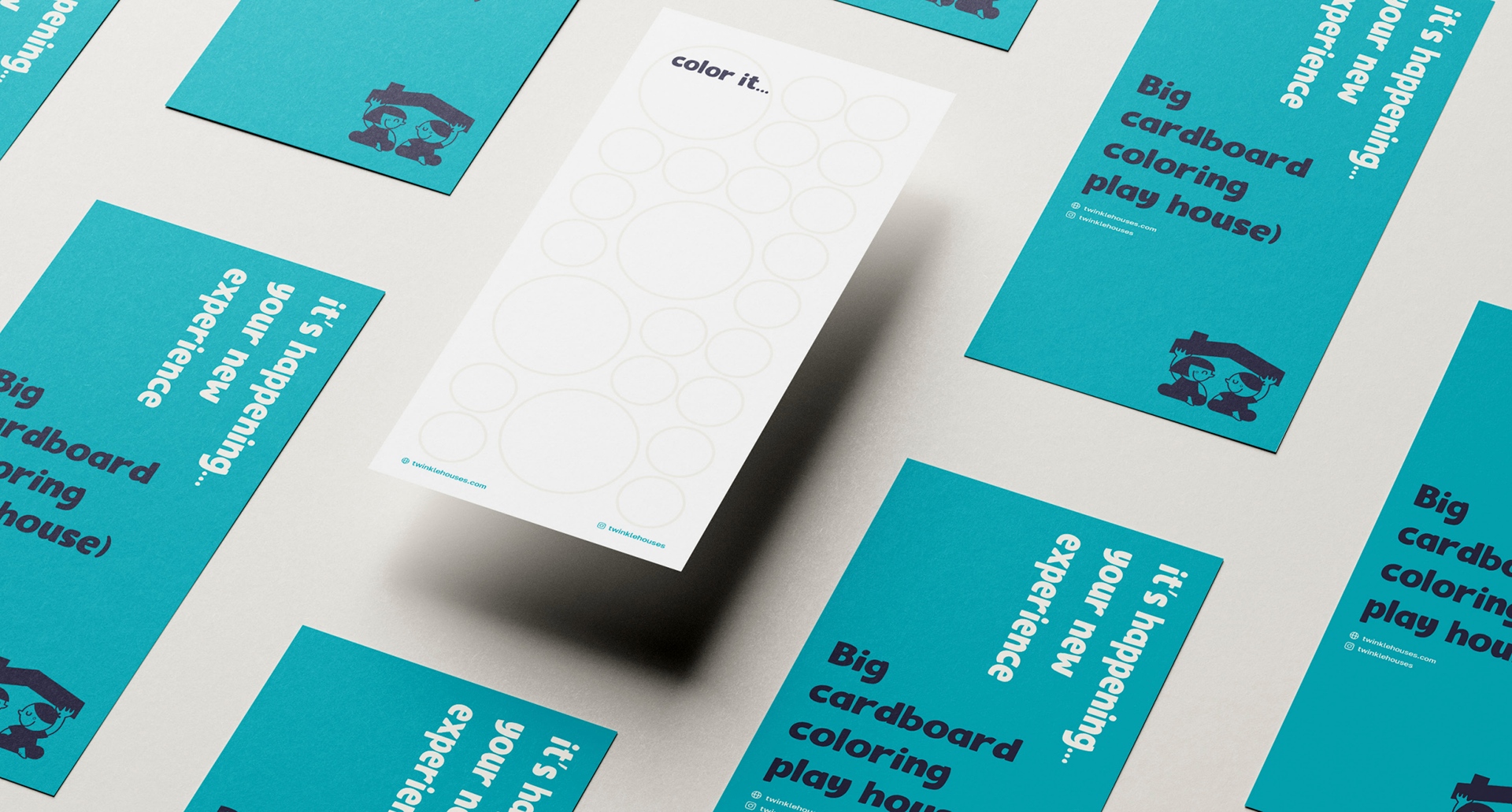
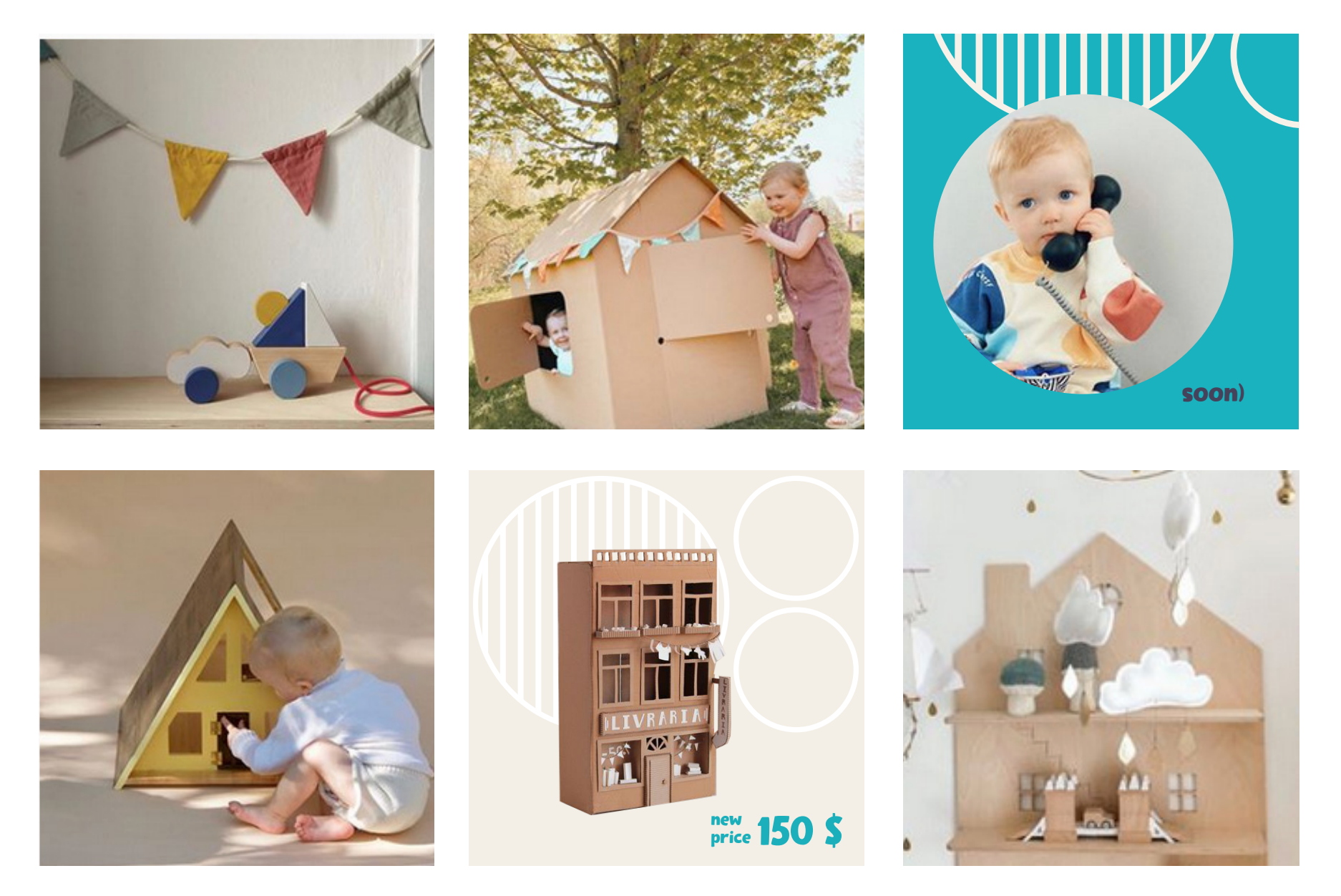
The social media visuals were designed with clean lines and minimalism, inspired by the cozy warmth of Scandinavian hygge. The focus was on blending an eco-conscious feel with a modern, inviting look, ensuring simplicity and warmth were central to the design.
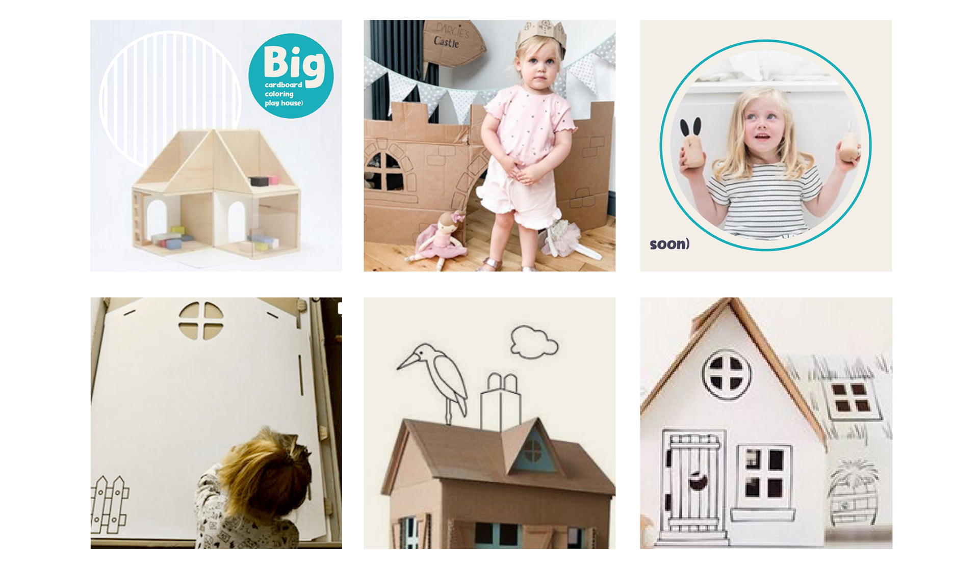
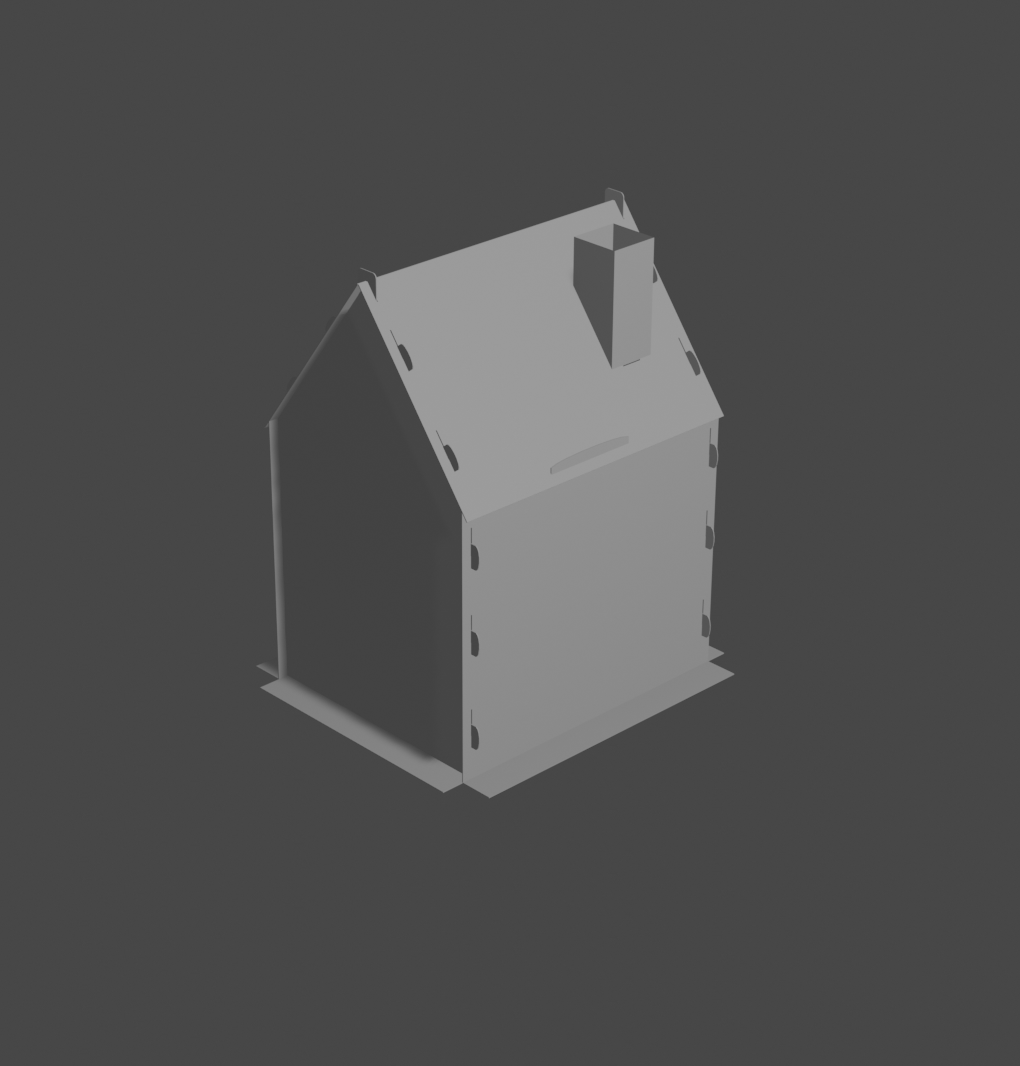
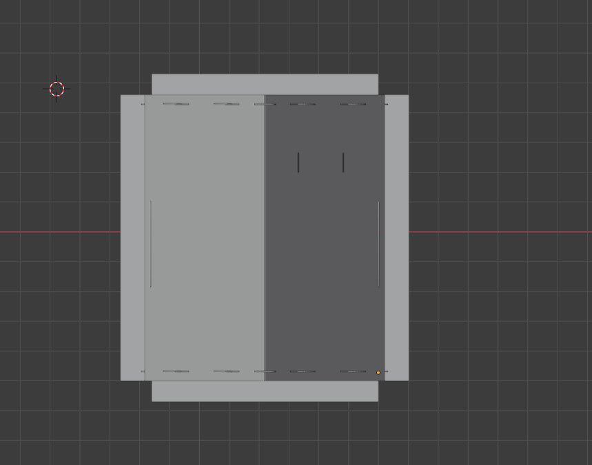
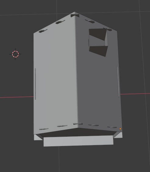
The cardboard playhouse mockup was an essential part of the design process, allowing for key refinements before moving to the final product. This step gave me the opportunity to experiment with different materials, adjust proportions, and fine-tune functionality. By testing these elements early on, I ensured that the final design stayed true to the original vision while meeting both aesthetic and practical requirements.


Mini-mockup of a cardboard playhouse.
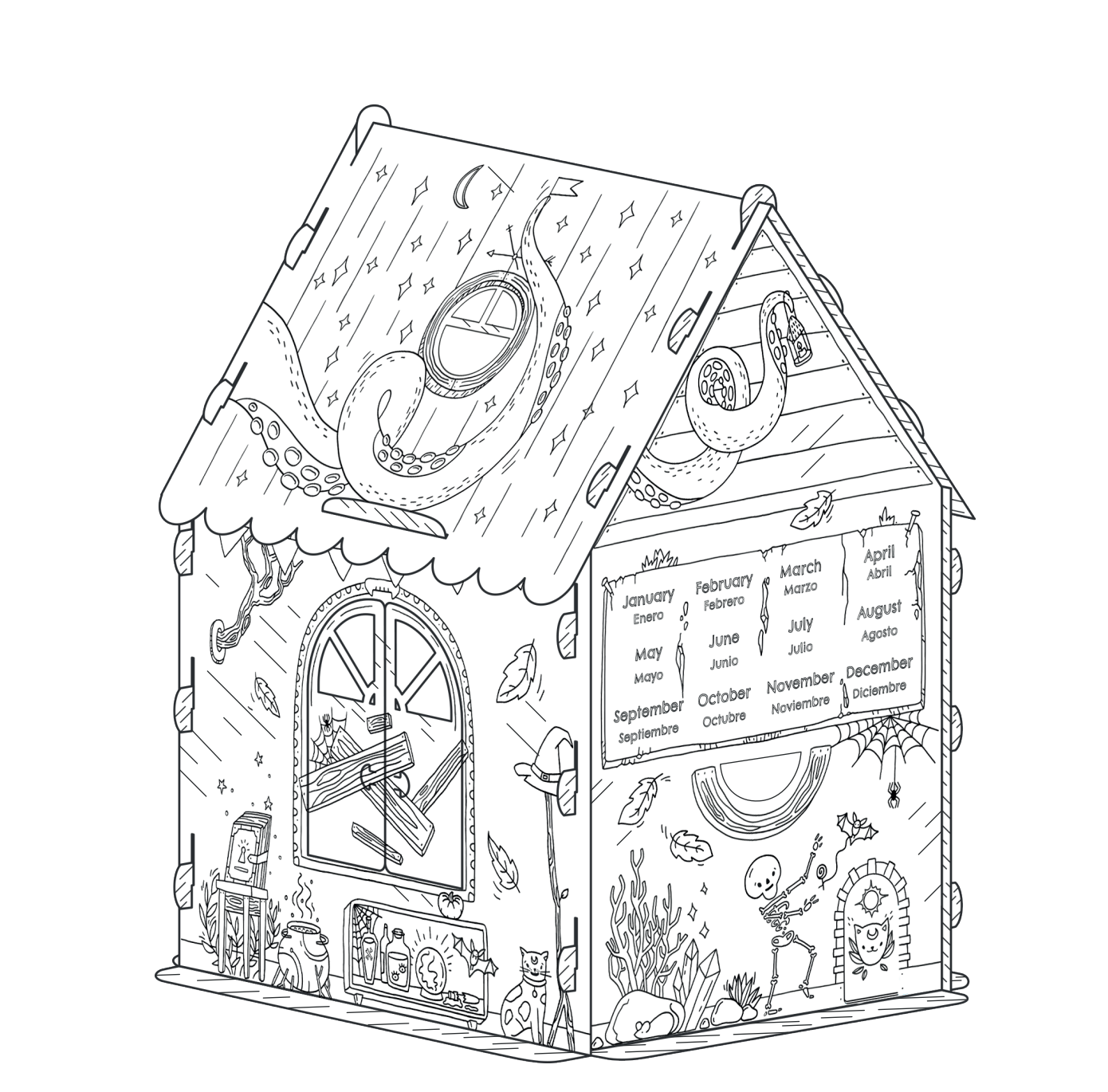
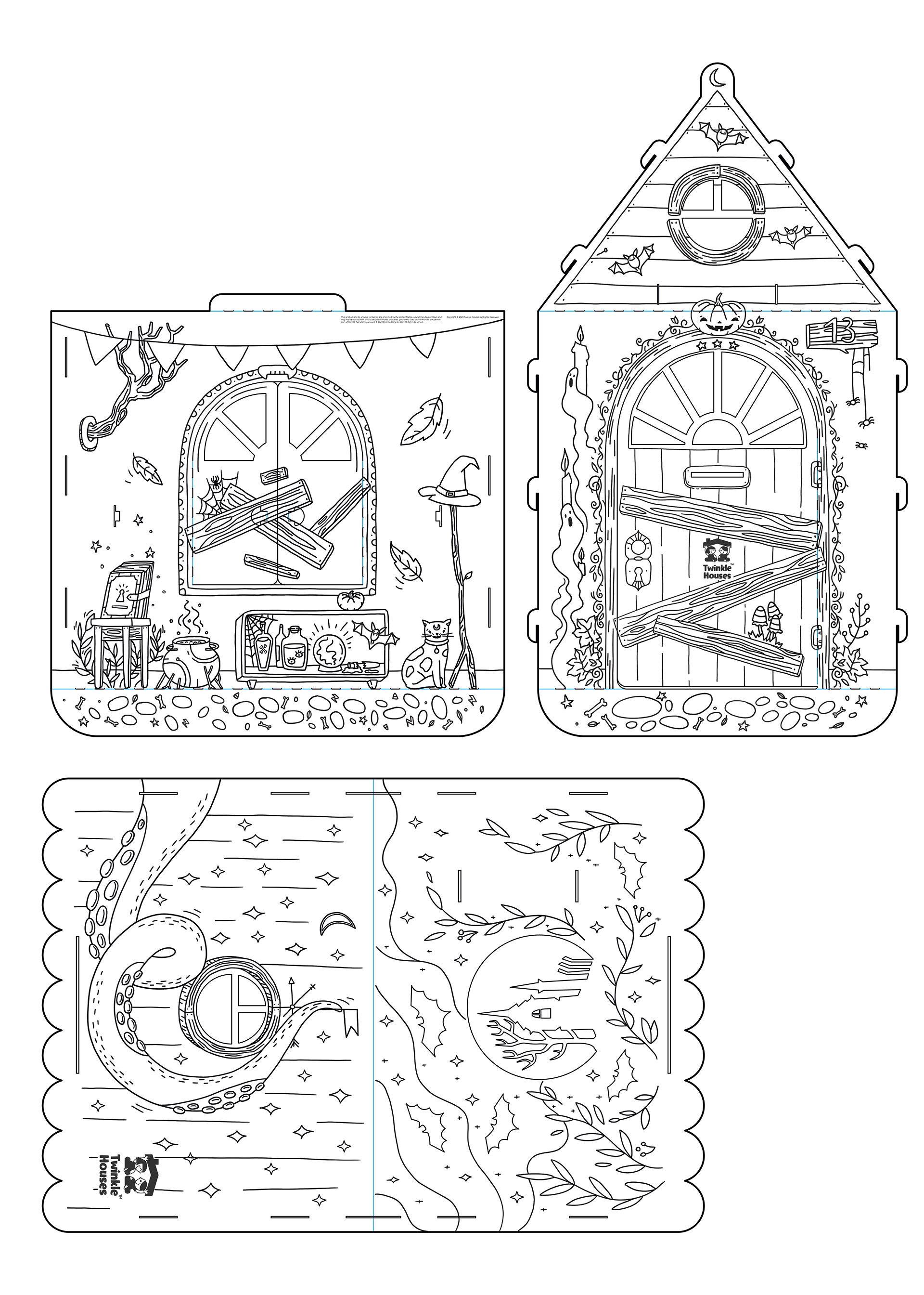
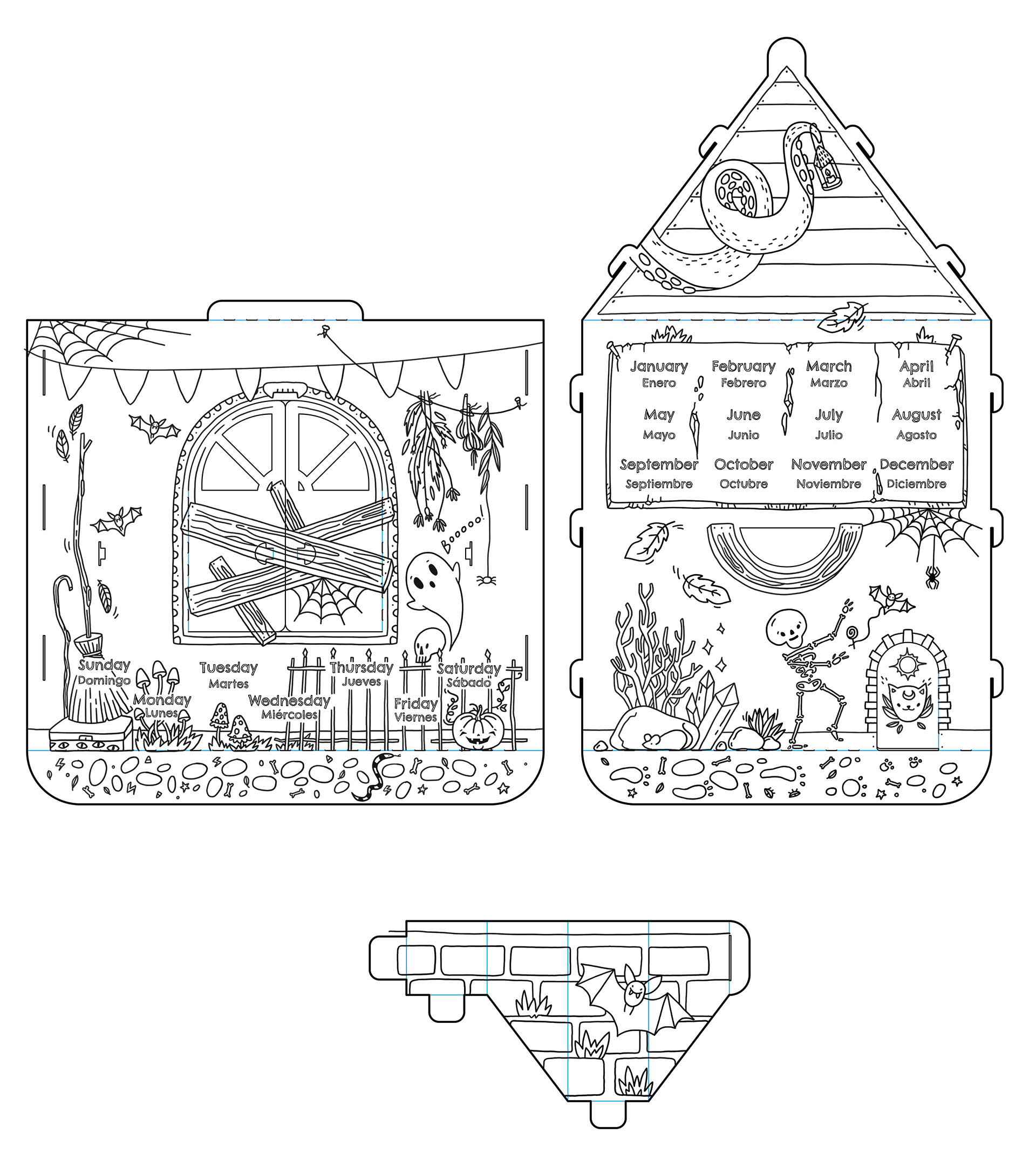
Halloween-themed playhouse sketch with integrated Spanish months learning elements.
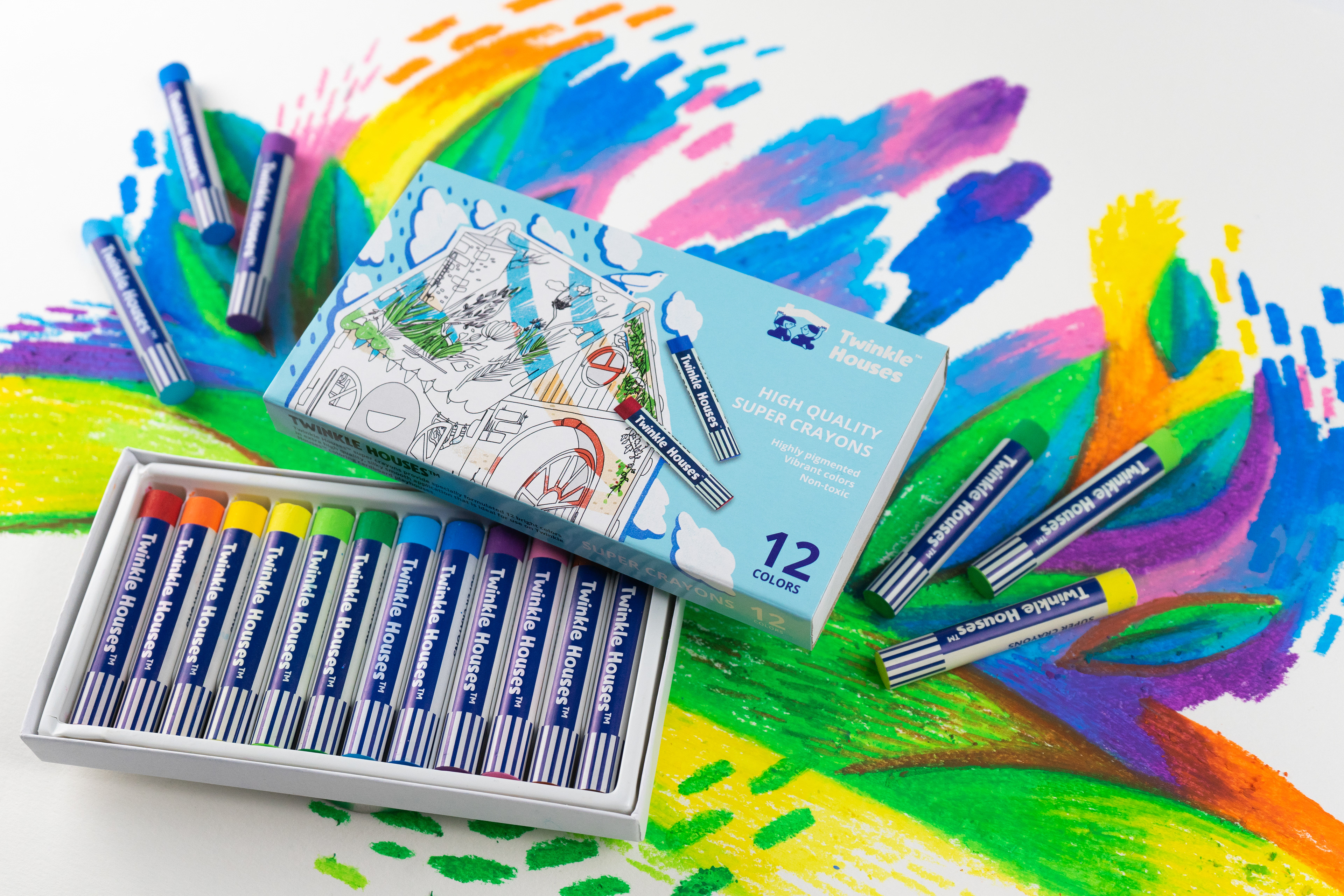
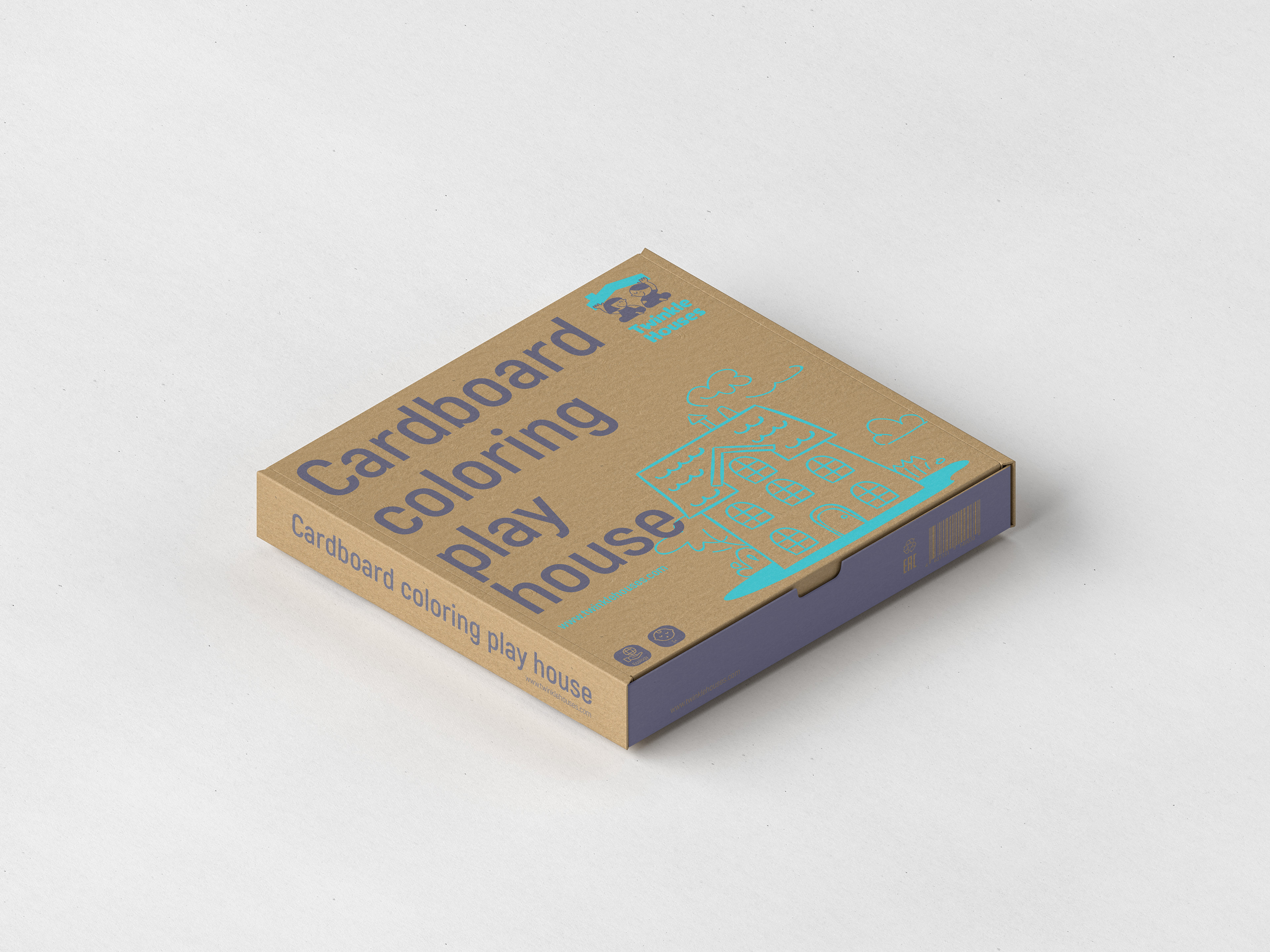
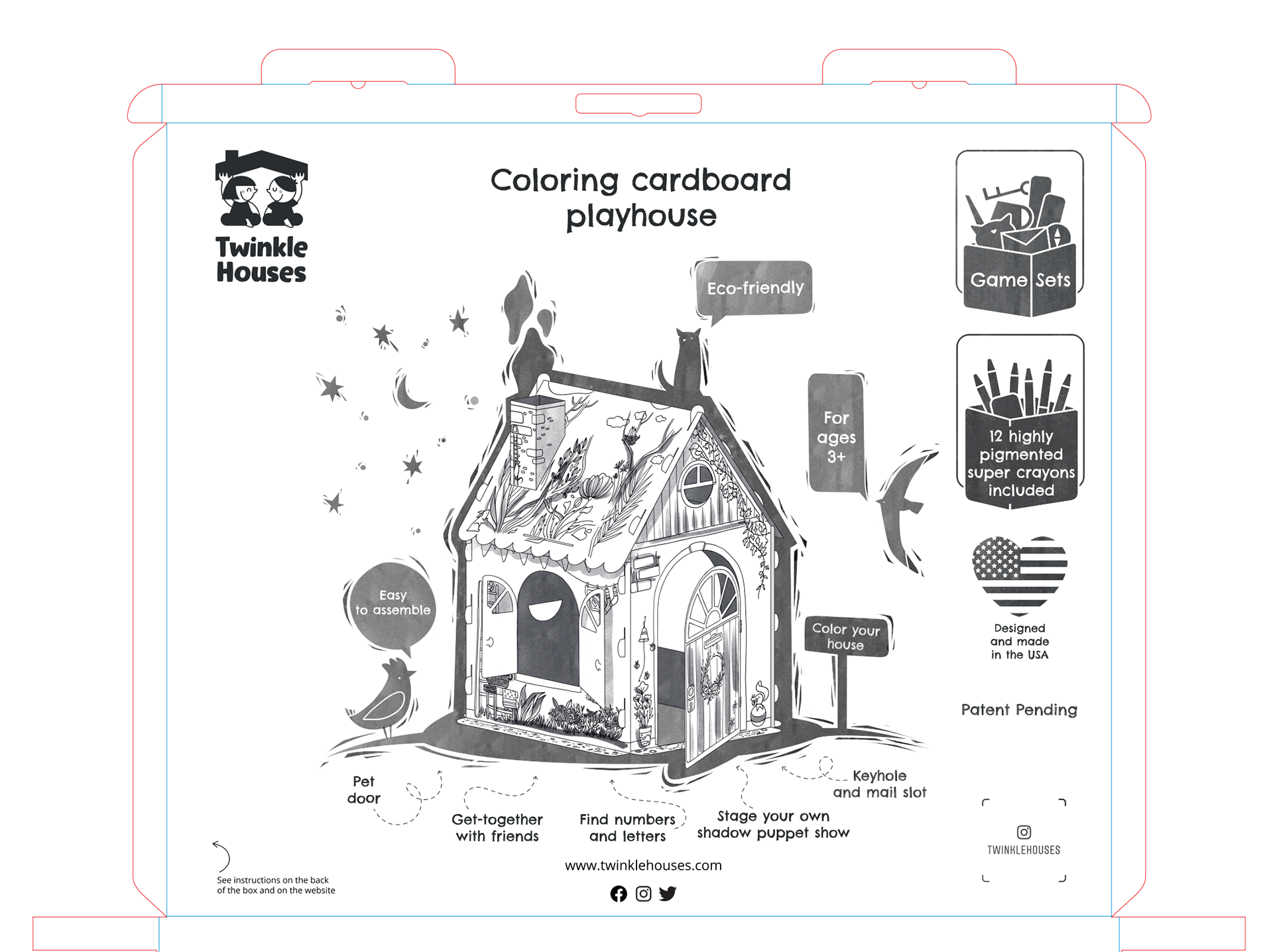
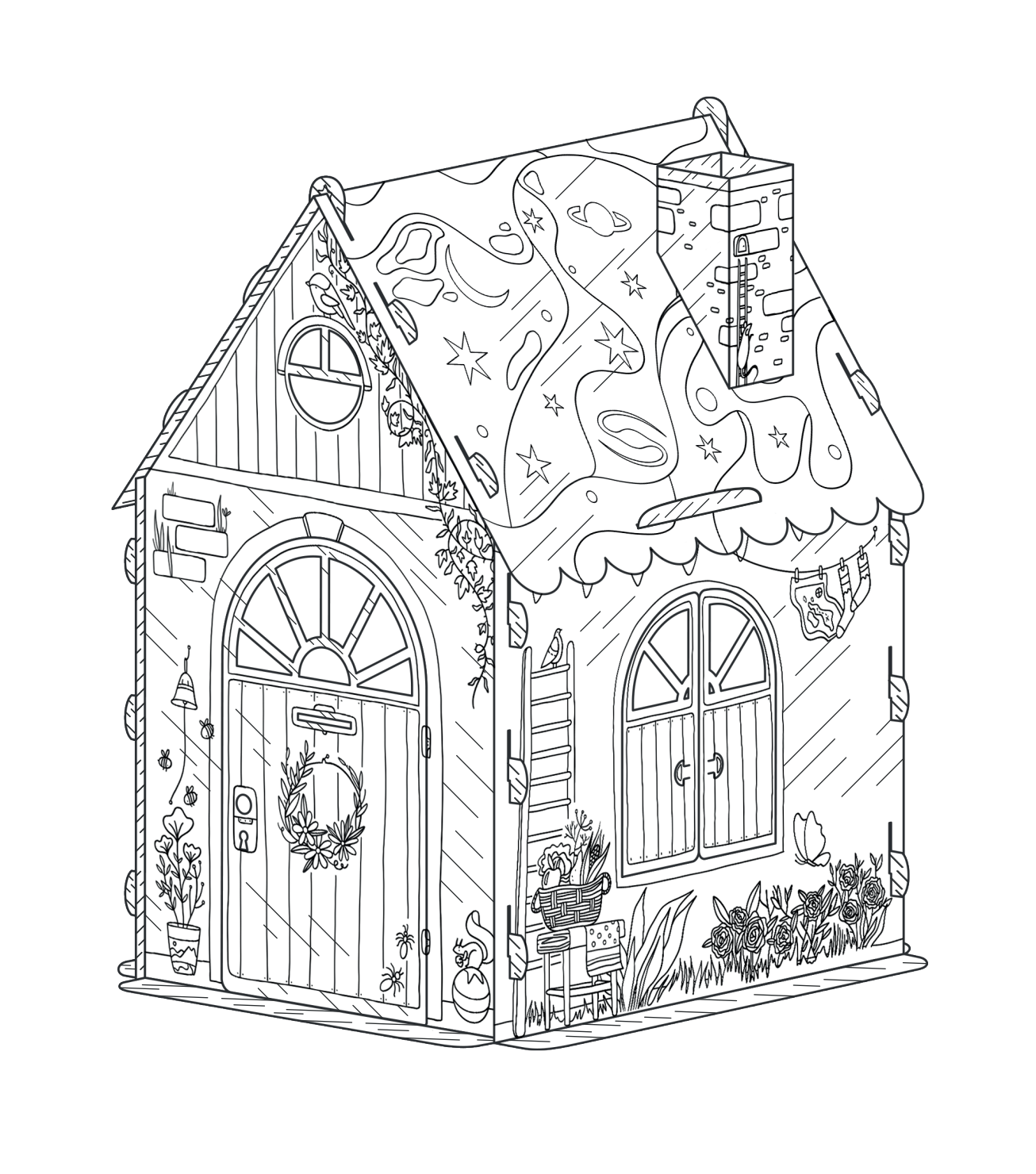
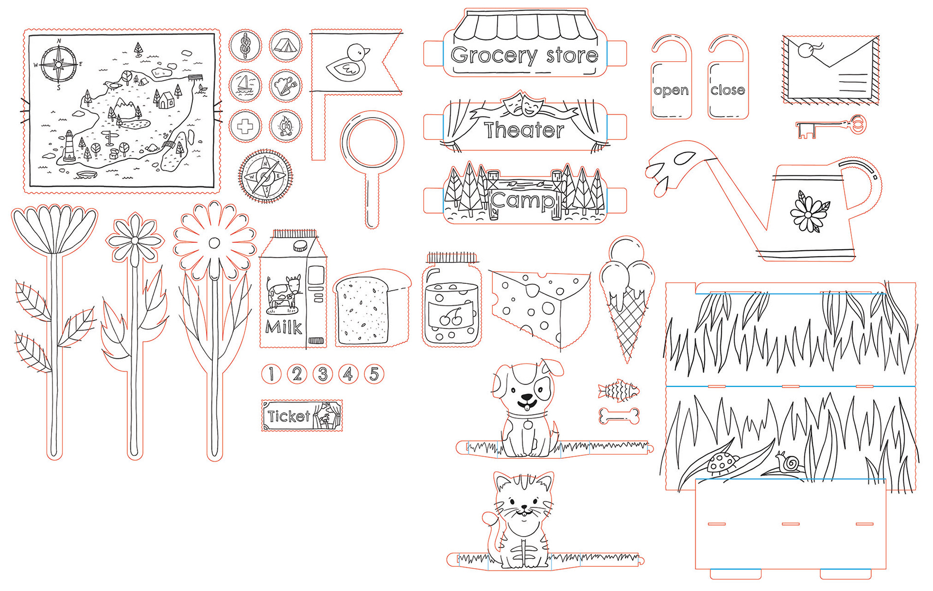
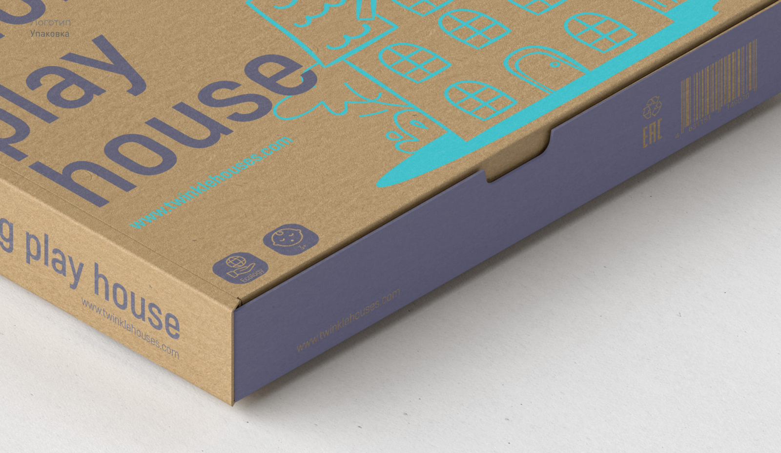
In designing the Twinkle Houses® coloring cardboard playhouse packaging, I aimed for a balance beyond minimalism and eco-friendliness. The layout strategically showcases key product features, user instructions, and included items like game sets and crayons. My focus was on creating an intuitive design that communicates value at a glance. Clean lines and thoughtful presentation were incorporated to ensure the packaging not only functions effectively but also enhances the overall product experience. This approach aligns the packaging design with the brand's commitment to creativity and user engagement, while efficiently conveying essential information to our target audience.
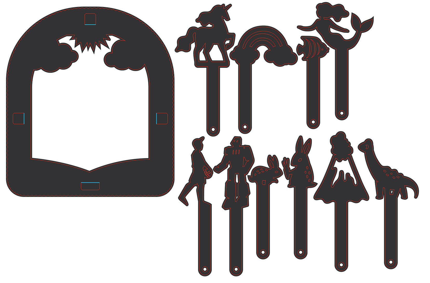
3D model of a modular component for the playhouse
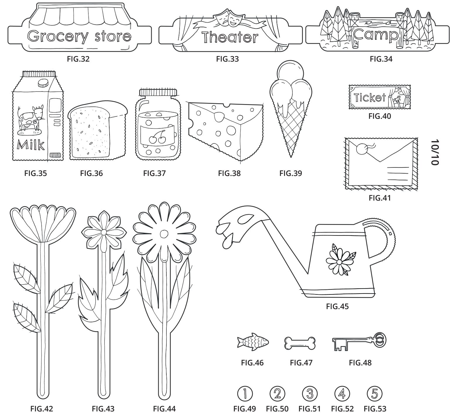
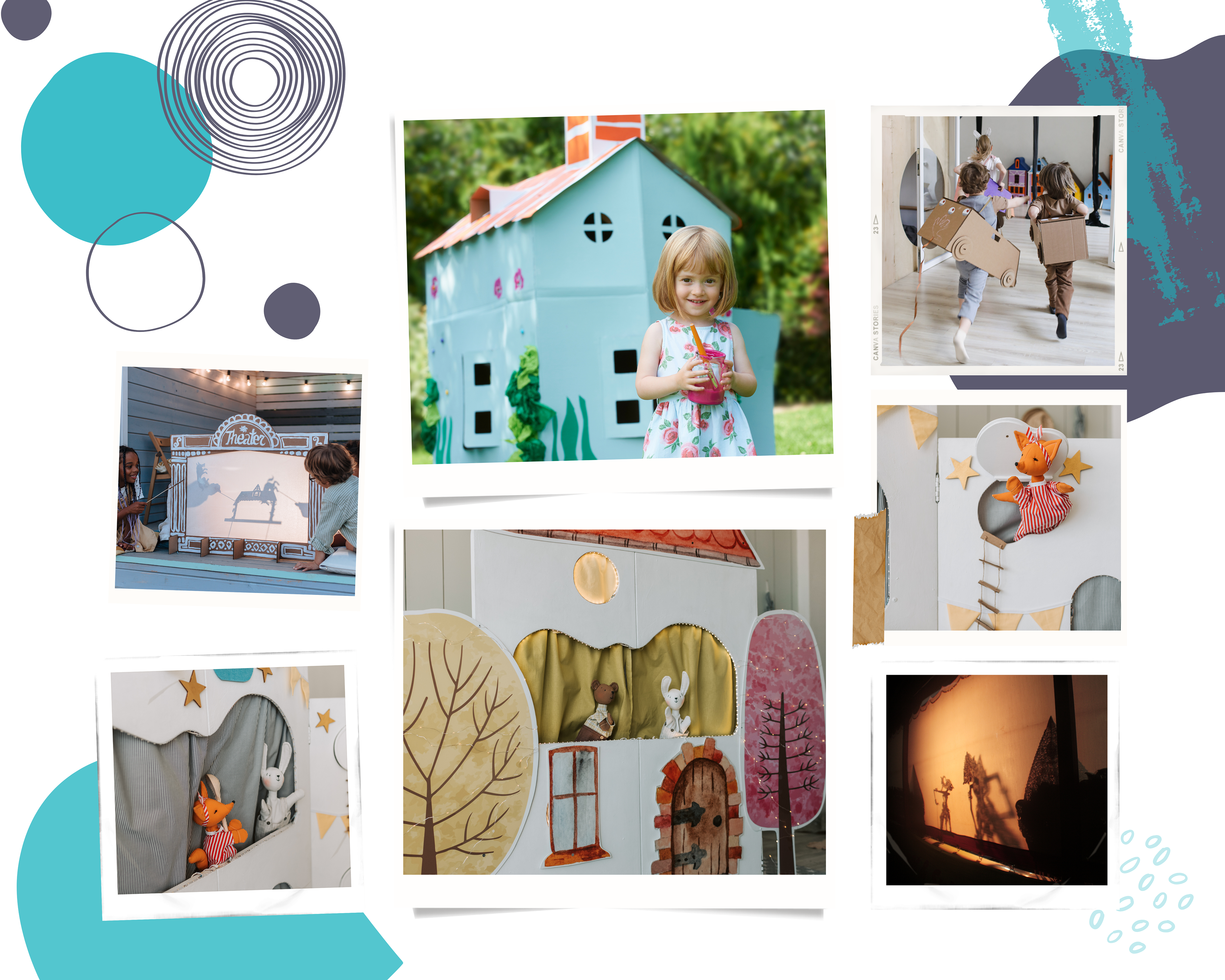
These themed playhouse accessory sets are designed to enhance imaginative storytelling through a shadow puppet play experience. Each set includes modular backdrops, character silhouettes, and interactive props that can be arranged to create diverse scenes. By simply adding a light source behind the silhouettes, children can project engaging performances onto walls or screens, fostering both creativity and collaboration. As they assemble their own theater environment and manipulate characters, they develop fine motor skills, experiment with storytelling, and hone problem-solving abilities. Offered in themes ranging from fantasy to nature and adventure, these sets provide endless possibilities for imaginative play.
Lights, shadows, action: Puppet show kits
Themed playhouse accessory sets
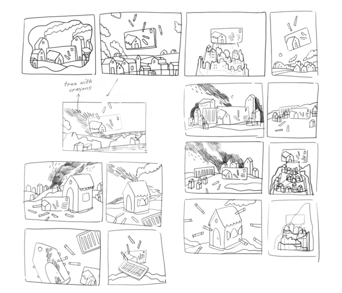
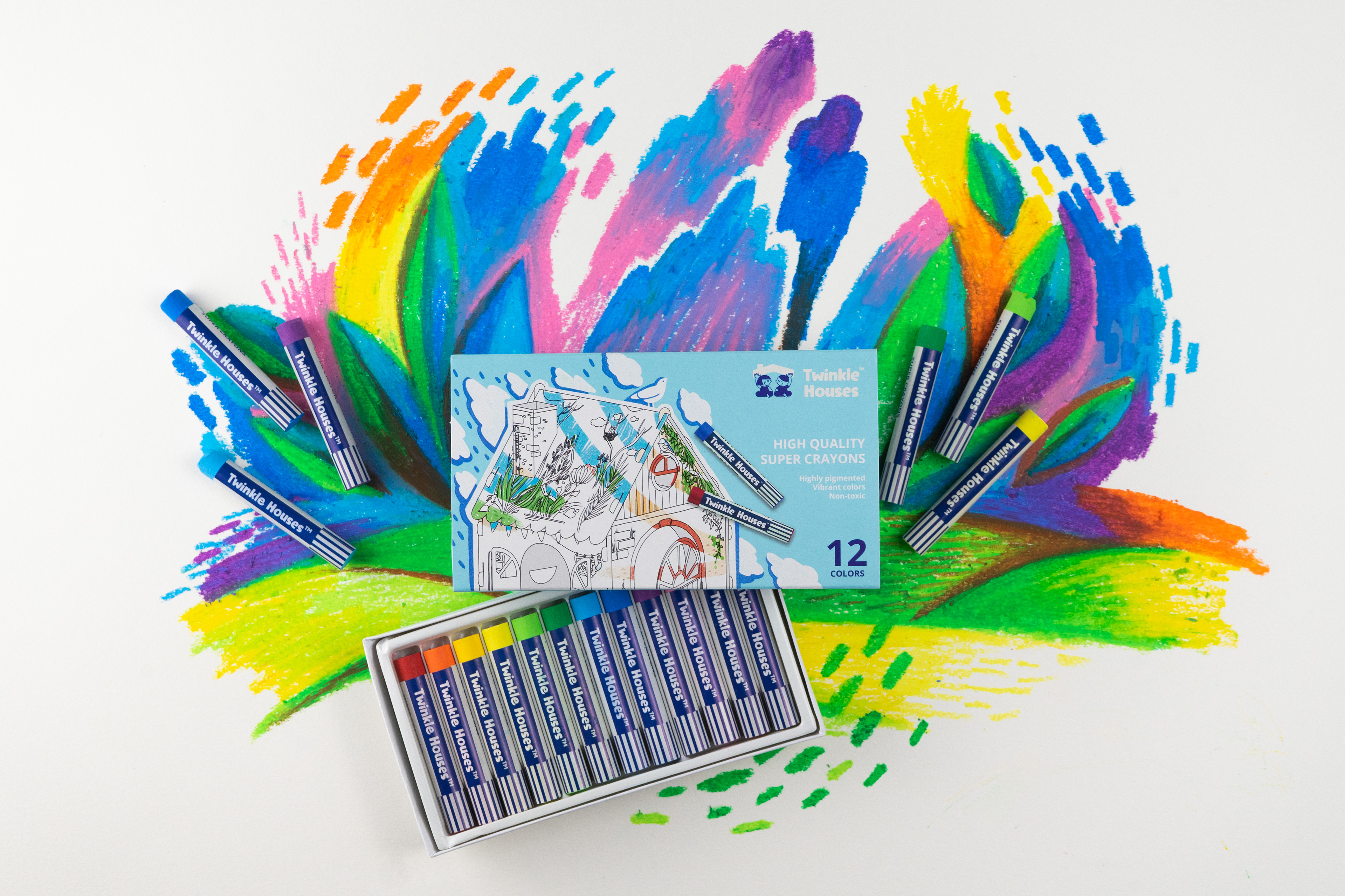
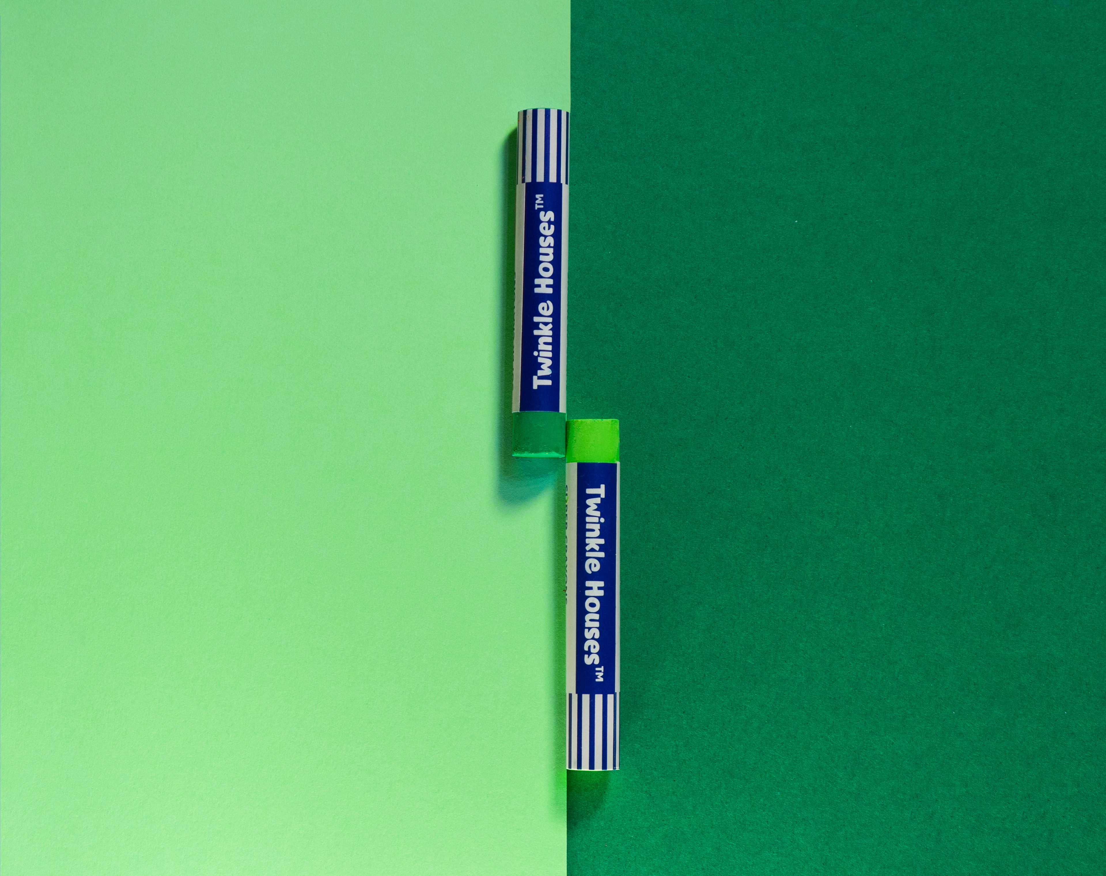
Before starting the photography, I planned out the process by sketching several scene ideas. I created a backdrop from white paper, shaping it into small houses and hills that would surround the crayon packaging. To bring the scene to life, I used the crayons to lightly draw hints of the sky and ground on the paper—not fully coloring them, but adding subtle touches to set the mood. This preparation led to the first series of photos, focusing on the crayon packaging within the paper scene. For the second series, I incorporated a miniature paper house as a central element, adding more depth and character to the overall composition. This detailed process allowed me to create visually engaging and cohesive imagery for the project.
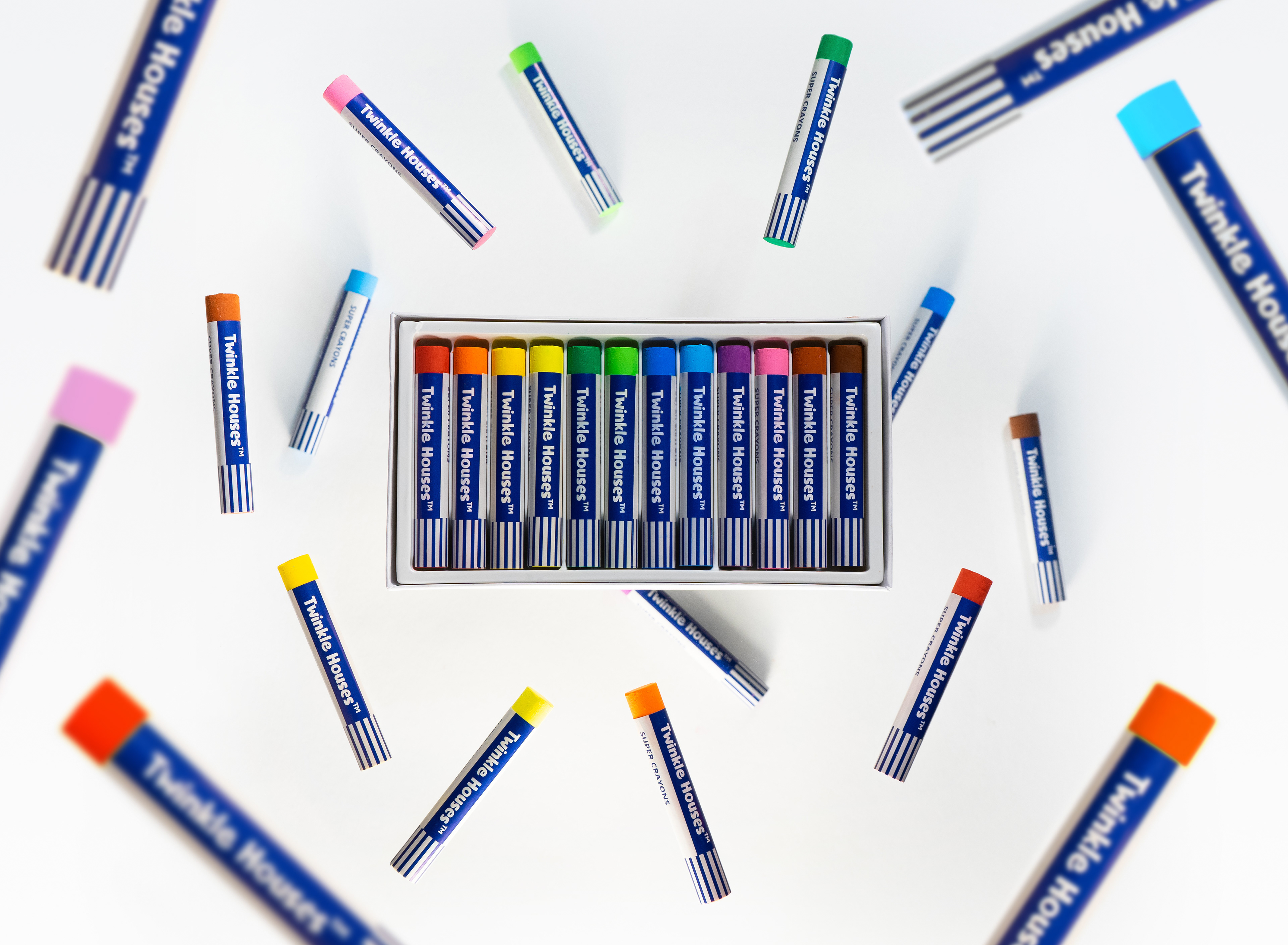
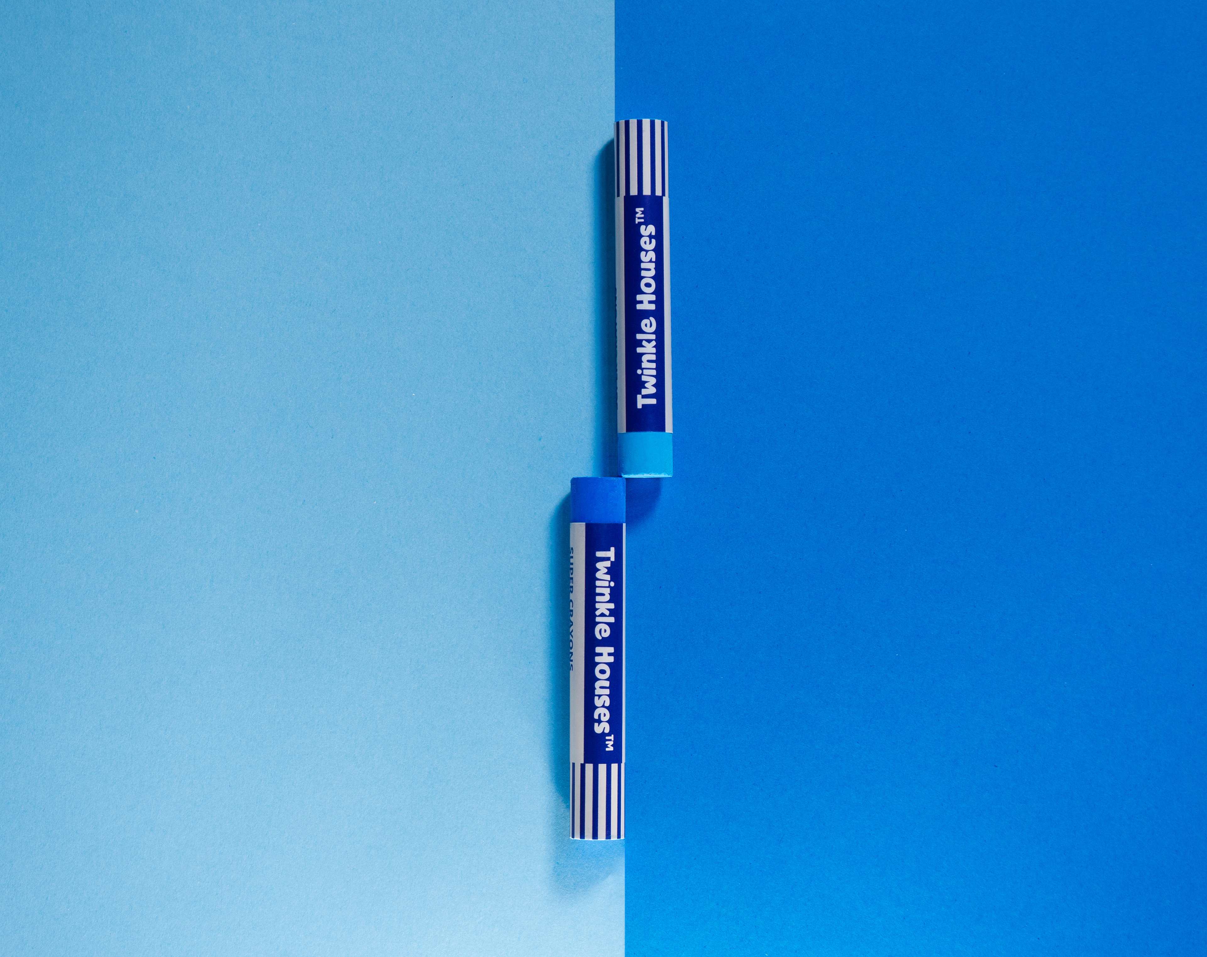
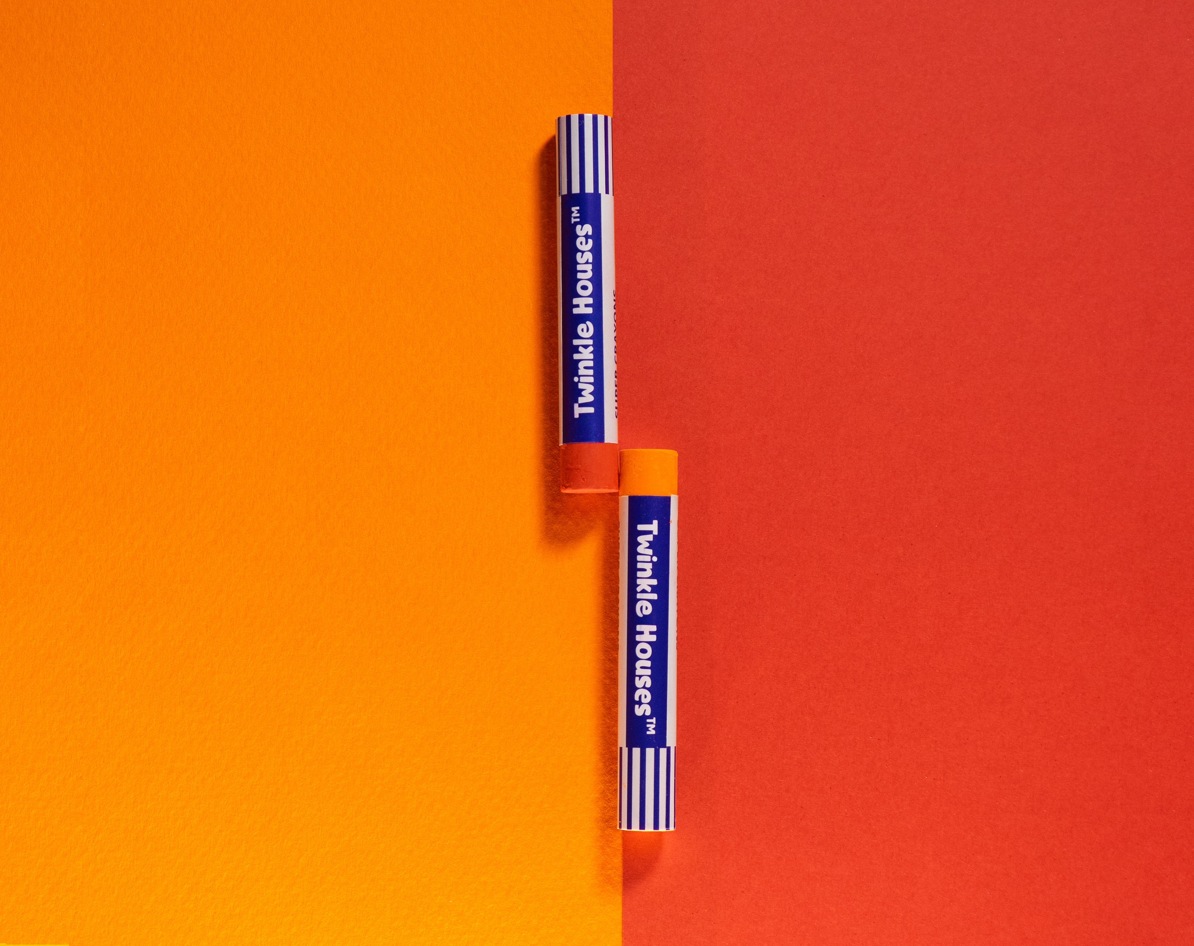
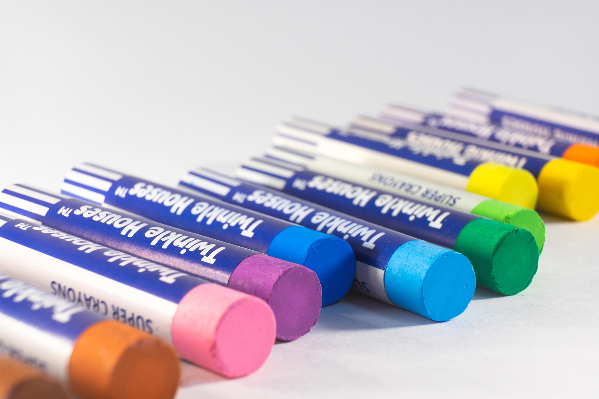
When photographing the Twinkle Houses® super crayons, I wanted to really show off their bright colors and smooth feel. I played around with contrast in the shots to make the crayons' rich colors and depth stand out. After the shoot, I used Illustrator and Photoshop to polish the images, tweaking the lighting and adding a cool spread effect that makes the crayons look alive on screen. I put a lot of thought into every little detail to capture the fun, creative vibe of the product. The idea was to make the final images just as exciting as the crayons themselves. This way, when people see the product photos in ads or on packaging, they'll get a true sense of how inspiring these crayons can be.